.jpeg)

If you've ever managed an annotation team, you know how hard it can be to get visibility into what's actually happening. Who's doing the heavy lifting? Which annotators need more guidance? How are corrections flowing through your review process? Without clear answers, maintaining label quality often comes down to intuition.
We're excited to announce Annotation Efficiency Metrics on Datature Nexus, a new dashboard that gives you real-time insights into how your team is performing, how reviews are structured, and where quality improvements can be made.
Why This Matters
Great training data doesn't happen by accident. It takes coordination across annotators and reviewers with varying skill levels and working styles. And when you're scaling up, small inefficiencies can snowball into big problems.
Case Study
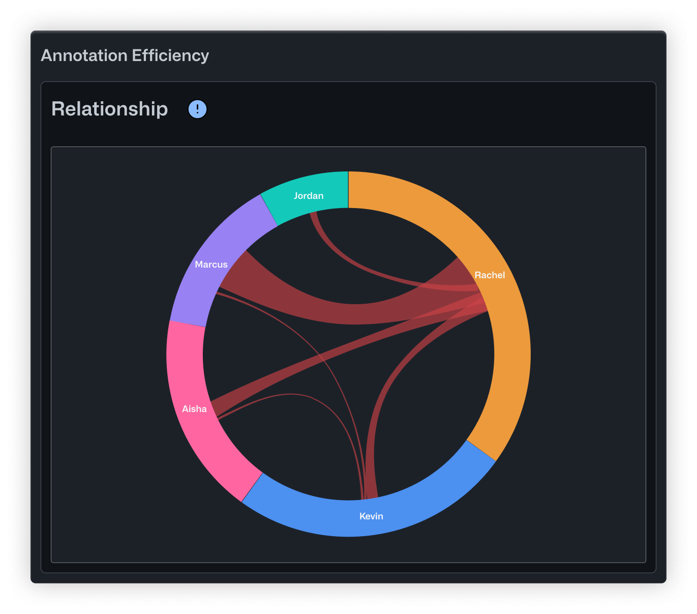
Take this example: a drone inspection company was labeling aerial images of solar panel defects for an insurance client. The client started complaining that recent batches had inconsistent labels. The team lead, Rachel, knew something was off but couldn't pinpoint where things were breaking down. She had five annotators submitting work at different times, and no way to see the bigger picture.
That's exactly the kind of situation Annotation Efficiency Metrics is built for.
What the Dashboard Revealed
Once Rachel enabled the new Performance tab, the problems became obvious within minutes.
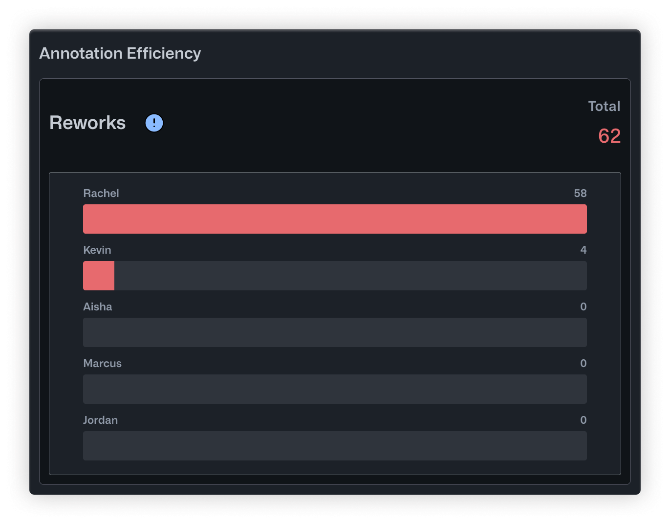
The Reworks chart showed that Rachel was handling almost all corrections herself. Out of 62 total reworks, she had done 58. Kevin, her most experienced annotator, had only reviewed 4. The workload was completely unbalanced, and Rachel was becoming a bottleneck.
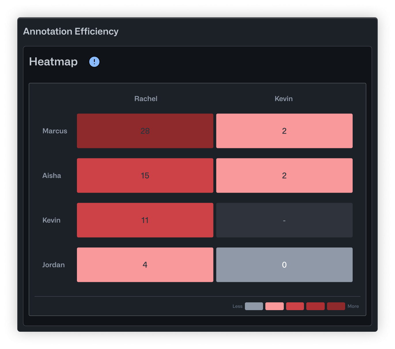
The Heatmap told a more specific story. Marcus, a junior annotator who joined three weeks ago, had 26 corrections to his work. That's not necessarily bad for someone new, but nobody had realized he needed that much support. Meanwhile, Jordan, a remote contractor who submitted work at odd hours, had almost no corrections at all. His row in the heatmap was nearly empty. It turned out his batches were slipping through without review entirely.
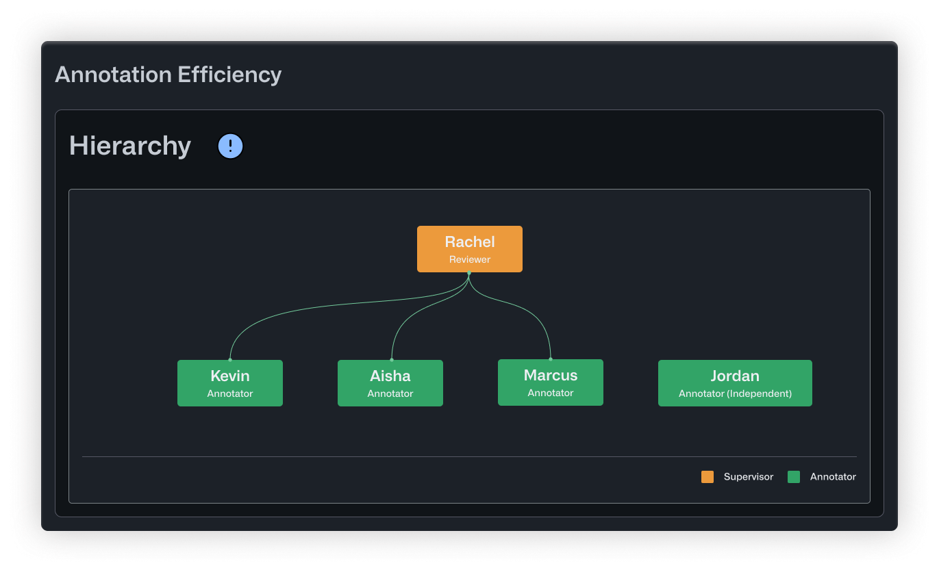
The Hierarchy view confirmed what the numbers suggested. Rachel sat at the top, connected to everyone. But Jordan appeared disconnected from the tree altogether, visually showing the gap in oversight.
What Changed
Armed with this data, Rachel made a few straightforward changes. She promoted Kevin to help with reviews, cutting her correction load in half. She paired Marcus with Aisha, a solid mid-level annotator, for weekly feedback sessions. And she added a policy that Jordan's batches needed same-day review before entering the training pipeline.
Within two weeks, the client stopped flagging inconsistencies.
What’s Included
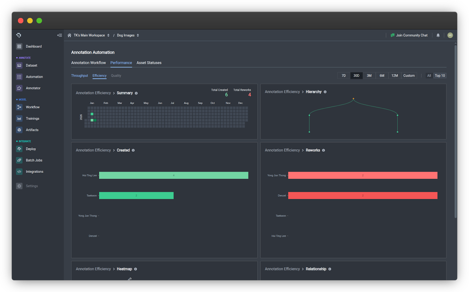
The new Efficiency tab under the Performance tab includes six visualizations that break down your team's activity and review patterns.
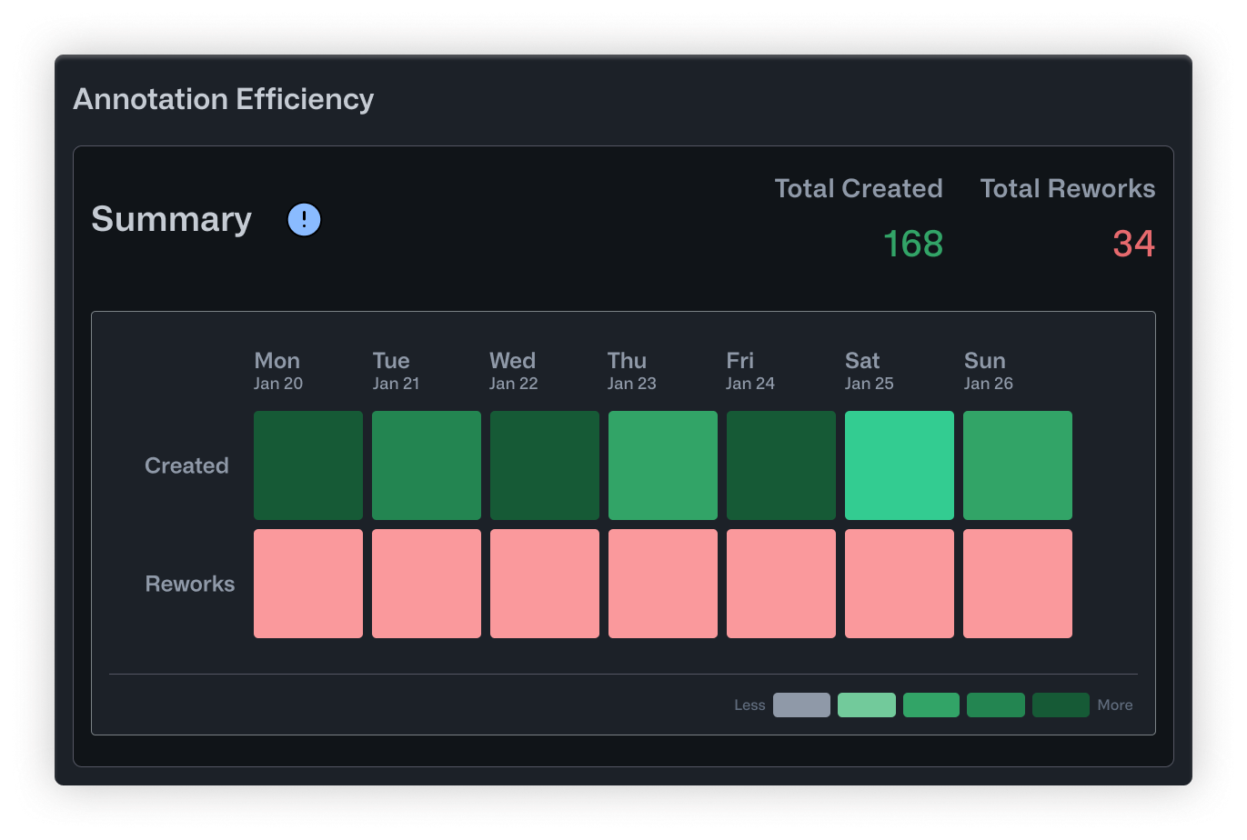
- Summary is a calendar heatmap showing daily annotation activity. Darker cells mean more work happened that day. It's a quick way to spot productive stretches, identify lulls, and keep tabs on overall momentum.
- Hierarchy maps out correction relationships in a tree structure. Reviewers sit at the top, with branches extending down to the annotators they supervise. Orange nodes indicate supervisors overseeing multiple people, while green nodes highlight specialists. This helps you see whether your review structure is balanced and who's responsible for quality oversight.
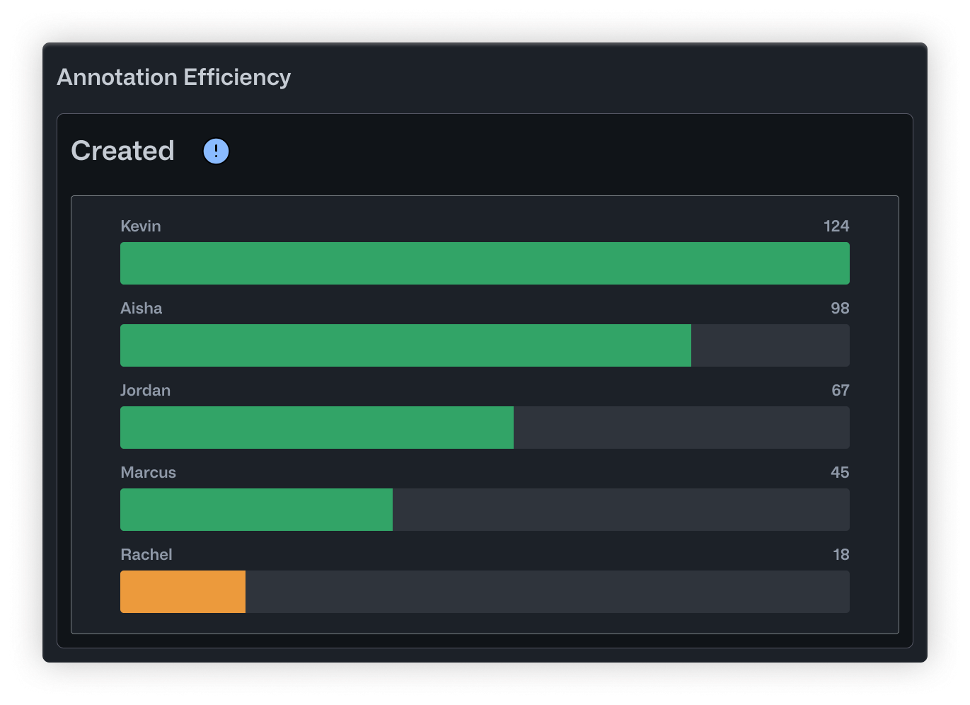
- Created is a straightforward bar chart showing how many annotations each person has produced. It's useful for recognizing your most active contributors and checking whether workload is distributed evenly.
- Reworks flips the perspective by showing how many corrections each user has made to other people's annotations. High numbers here point to your most active reviewers. It also helps surface annotators who might need extra support or clearer instructions.
- Heatmap displays correction relationships in a grid. Rows are annotators, columns are editors, and darker cells mean more corrections were made. You can quickly see who tends to need revisions and who's doing the fixing.
- Relationship uses a chord diagram to show how corrections flow across the whole team. Arc sizes reflect each person's overall involvement, and the ribbons between them show specific correction pairs. It's a good way to get a sense of your review dynamics at a high level.
Putting It Into Practice
Whether you're labeling medical scans, retail inventory, or factory floor footage, knowing how your team collaborates is key to producing reliable labels. These metrics help you delegate tasks more effectively, spot opportunities for coaching, and make sure your review process is actually catching issues before they reach your model.
You can find Annotation Efficiency Metrics in the Performance tab under Annotation Automation. Just open a project with an active workflow and start exploring.
If you have feedback or questions, drop us a note in our Community Slack.
.png)
.png)