

Understanding and managing image data can be overwhelming, especially when working with hundreds or thousands of images across diverse datasets. Today, we're excited to announce the release of our t-SNE Embedding Projector feature on the Datature platform - an intuitive way to visually explore your image embeddings, organize, and identify meaningful clusters at a glance.
What are Image Embeddings?
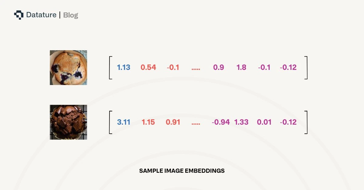
Image embeddings are high-dimensional vector representations of images produced by deep learning models. Each embedding captures the semantic and visual features of an image - objects, shapes, colors, and even abstract attributes. These embeddings are used for tasks like image retrieval, classification, clustering, and anomaly detection.
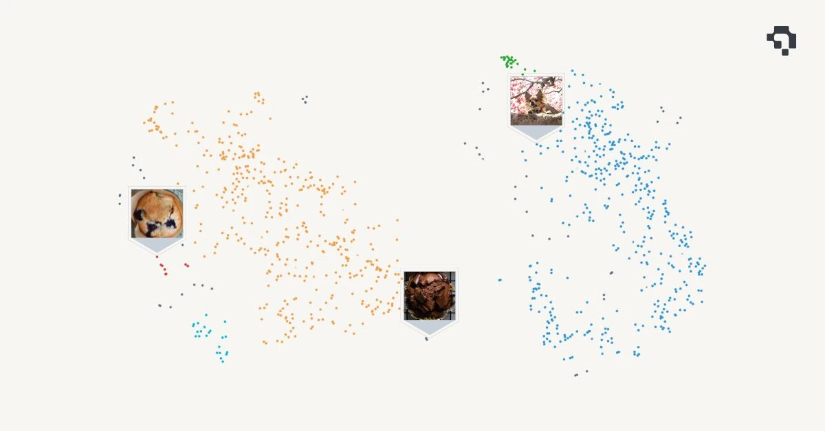
For example, two visually similar images (e.g., two photos of muffins) will have embeddings that are close to each other in this high-dimensional space.
Typical Dimensions of Image Embeddings
The dimensionality of an image embedding depends on the architecture of the model used to generate it. Common dimensions include
- 512-dimensional vectors (e.g., from lightweight models like MobileNet)
- 768-dimensional vectors (e.g., from Vision Transformers or intermediate layers of CLIP)
- 1024 or 2048-dimensional vectors (e.g., from deeper CNNs like ResNet-50/101 or EfficientNet)
Higher-dimensional embeddings typically retain more detailed features but may be more computationally expensive to process.
What is t-SNE?
t-SNE (t-distributed Stochastic Neighbor Embedding) is a popular machine learning algorithm for visualizing high-dimensional data by reducing it to two or three dimensions. Unlike traditional linear dimensionality reduction techniques like PCA, t-SNE preserves local structure and reveals patterns in data that might otherwise remain hidden.
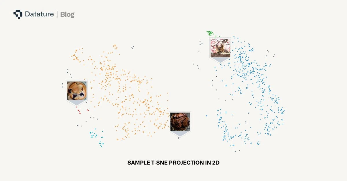
In simple terms, t-SNE helps you "see" how similar or different your data points are by mapping them into a 2D plane where proximity means similarity. This makes it incredibly useful for visualizing image embeddings, natural language embeddings, and more.
Why Visualize Clusters of Image Embeddings?
Visualizing clusters of image embeddings offers multiple practical and strategic benefits for teams working with visual data
- Detect Duplicates or Near-Duplicates:
Quickly surface images that are nearly identical, even if file names or metadata differ. This is especially useful for cleaning datasets or reducing redundancy before model training. - Spot Anomalies and Outliers:
Identify images that are visually or semantically different from the rest of the dataset. These could be mislabeled images, corrupted files, or rare edge cases worth further inspection. - Understand Data Distribution:
Gain an intuitive overview of how your data is spread out. Clusters may represent different classes, scenes, or object types, giving you insight into whether your dataset is balanced or skewed. - Improve Labeling and Curation Efficiency:
Instead of reviewing images one-by-one, use cluster visualization to annotate similar images in bulk, focus on ambiguous clusters, or prioritize diverse samples for active learning workflows. - Enable Interactive Exploration:
With tools like the lasso selector on Datature, users can directly engage with visual clusters, segmenting data for inspection, export, or further processing.
In short, cluster visualization bridges the gap between raw embedding vectors and human intuition, making image-based workflows dramatically more efficient and interpretable.
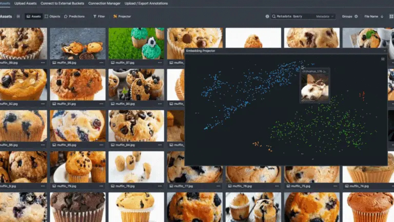
Using t-SNE Visualization Tool on Datature
Users can navigate to the Asset Tab of their projects and there will be a button named “Projector” that launches the asset projection mappings. This may take awhile to compute, depending on the size of the dataset.
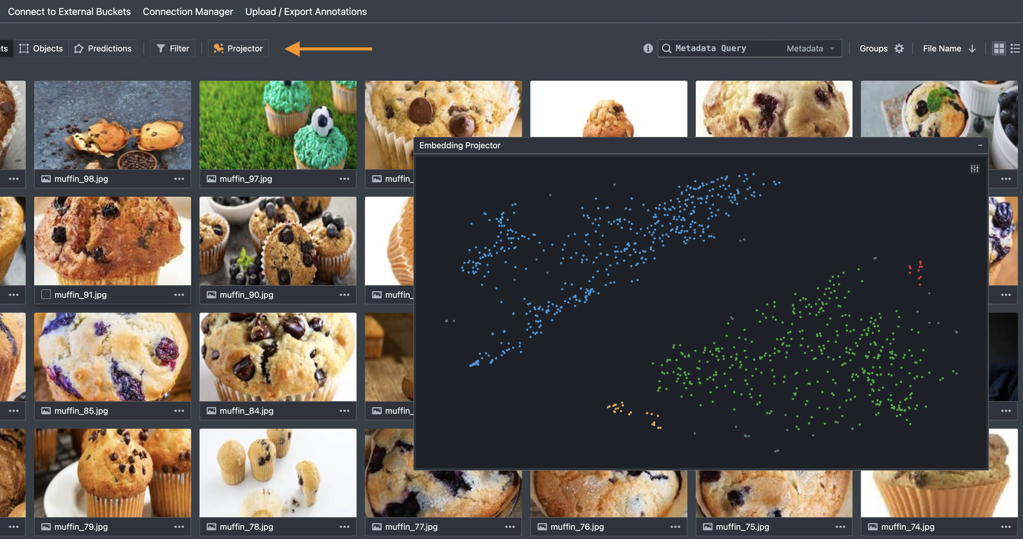
To explore specific clusters, use the lasso tool to draw around points on the projection. The dataset view will instantly filter to show only the selected assets. You can also hover over any point to preview the corresponding image.
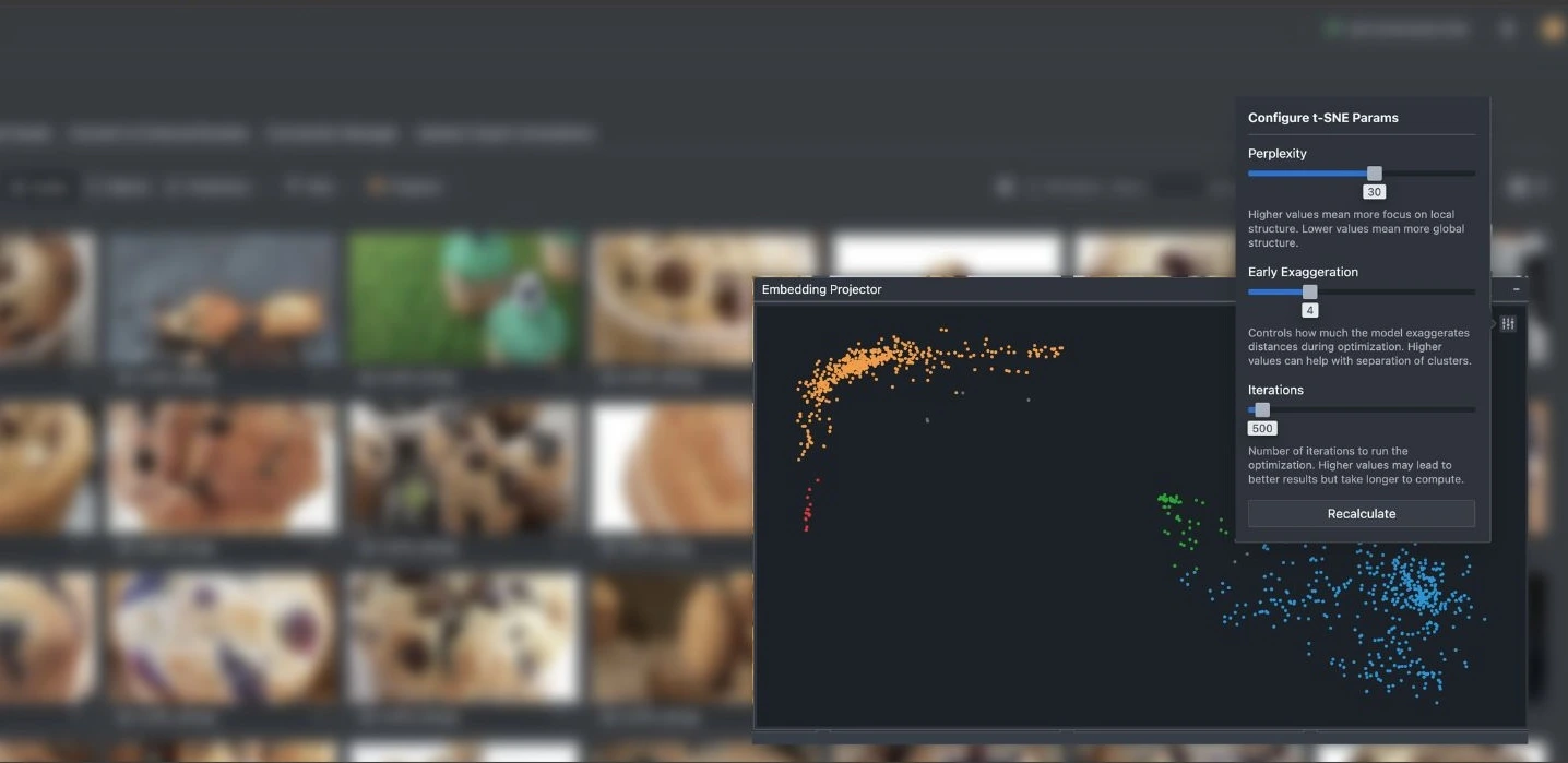
For more control, advanced users can also adjust the t-SNE hyperparameters through the settings menu located at the top left of the visualization interface. Parameters such as perplexity, learning rate, and iteration count can be tuned to affect how clusters form and separate. Once adjusted, simply recalculate to regenerate the layout. Keep in mind that higher iteration counts may result in more refined visualizations but will take slightly longer to compute.
This feature is currently in Beta, and we're actively gathering feedback to refine it further. Whether you're managing medical imagery, drone footage, retail products, or manufacturing defects, this tool is designed to streamline your data curation workflows.
Putting Everything Together - How We Built This Feature
Image embeddings are computed on upload, we apply the t-SNE algorithm to reduce these high-dimensional vectors (typically 768 or more dimensions) down to a 2D plane suitable for visualization. To enable this feature, we leveraged the following steps ↘
- Embedding Normalization:
We normalize each embedding vector (typically using L2 normalization or MinMax scaling) to ensure uniform magnitude across samples. This helps mitigate issues where certain dimensions dominate the distance metrics due to scale discrepancies or outliers. - Distance Matrix Calculation:
A pairwise similarity or distance matrix is computed based on cosine similarity or Euclidean distance. This forms the basis for constructing neighborhood relationships in the high-dimensional space. - t-SNE Optimization:
We run a version of t-SNE (“tsne-js”) in a web worker environment to offload the heavy computation from the main browser thread. - DBSCAN Clustering:
After projection, we apply DBSCAN (Density-Based Spatial Clustering of Applications with Noise) to the 2D output. DBSCAN groups dense regions together and assigns distinct colors to each identified cluster, making visual interpretation easier.
This end-to-end pipeline transforms raw embeddings into a highly interpretable 2D visualization that preserves local structure and reveals clusters, anomalies, and data relationships that are otherwise buried in high-dimensional space.
Explore Further with Our Developer Roadmap
Have questions or feedback about the t-SNE Embedding Visualization feature? Join our Community Slack to connect with other developers, share insights, or get support from our team.
.png)
.png)