Visualization
Visualization in machine learning refers to the graphical representation of data, model behavior, and training progress to help practitioners understand, debug, and communicate their work. Good visualizations reveal patterns that raw numbers cannot: a confusion matrix heatmap instantly shows which classes get confused, a training loss curve exposes overfitting at a glance, and overlaid predictions on images let you see exactly where the model succeeds and fails.
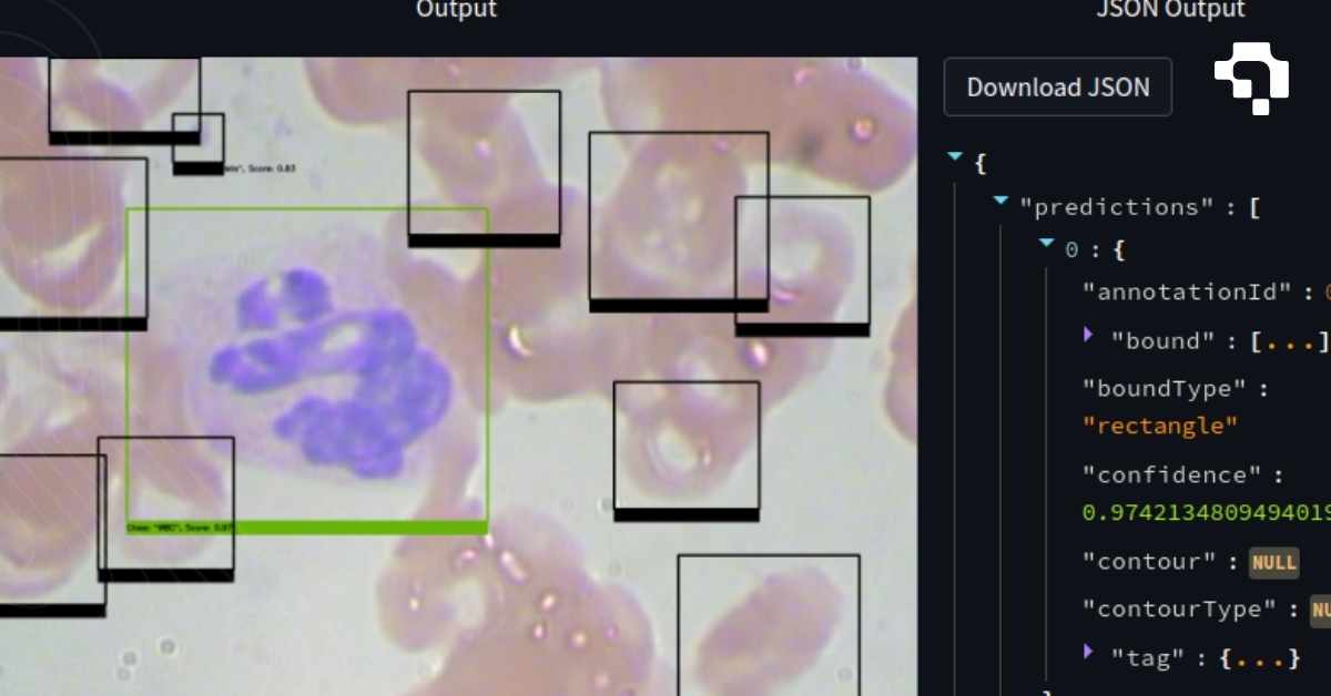
Common visualization types in computer vision include: prediction overlays (drawing bounding boxes, masks, and keypoints on images), training curves (loss and metrics over epochs), feature map visualizations (what intermediate layers "see"), attention maps and Grad-CAM heatmaps (which image regions drive predictions), t-SNE and UMAP embeddings (visualizing high-dimensional features in 2D to check cluster separation), and confusion matrices (classification error patterns).
Tools like TensorBoard, Weights & Biases, and matplotlib are standard for training visualization. For prediction inspection, most annotation platforms (including Datature Nexus) provide visual overlays of model outputs on images. Effective visualization is not optional: it's how you catch label errors, identify model weaknesses, justify design decisions to stakeholders, and build confidence that a model is ready for deployment.